A Peek At My Pull List
A Peek At My Pull List
I’m spending waaay too much on comics, so last month I decided to make some changes to my pull list at Hall of Heroes in Cherry Hill, NJ.
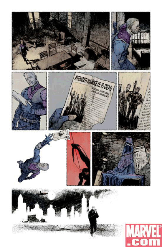
 New Avengers: DROPPED I’ve grown completely cold on The New Avengers so I dropped it. It’s a great story. I love the idea of an underground Avengers team, and the line-up of heroes is phenomenal. I was even willing to hang with the tiresome story about The Hand and H.Y.D.R.A. and Electra. I didn’t care who Echo was… or Ronin, for that matter. And if one was dressing up as the other, you couldn’t have known it by me. But — again — the characters and the concept had me coming back for several weeks.
Until, finally, I couldn’t take one more month of those scratchy illustrations. They’re just killing me.
And if the illustrations didn’t have me out the door, the layout sealed the deal.
The standard reading pattern for a comic book is to read the left-hand page and then the right-hand one.
Every now and then, this book decides to treat two facing pages as a single unit — in which the reader must read all the way across the top of the left to the top of the right, then go back to the middle of the left (and so on). And that’s fine. But… the last panel at the top of the left page should span over to the top of the right page to cue the reader of the new reading pattern. Like a bridge. Otherwise, the reader is going to read this page just like every other freaking comic-book page he’s read in the past six months.
I can’t tell you how often in the last several issues I’ve gotten to the bottom of the left-hand page wondering what the heck was going on — only to get to the top of the right-hand page and realize that I was supposed to have been reading all the way across this time.
I’m out.
 She Hulk: DROPPED I’m still second-guessing my decision here. I love Dan Slott. I love his concepts and his plots. But the S.H.E.I.L.D. arc is boring me silly,
 and I’m not seeing enough of the law firm. Slott wrote in the Comments section to this post that Shulkie returns to the law firm TODAY. Talk about service!
Worse yet, the illustrations of a character who should be a knock-out keep reminding me of a transvestite in a green wig. The images are stiff and lifeless. Shulkie is un-sexy and drab. I just can’t hang with it. It’s gone… but if I start missing Slott’s wiseacre prose, I may be back within a month. OK…OK… make that “definitely.”
 Green Lantern: ON PROBATION The Star Sapphire story is interesting enough — even if it’s being spread pretty thin over several issues. But more distracting to me is the paint-by-numbers illustration style. Issue after issue, I’m suckered in by some super-sharp draftsmanship on the cover only to see this soft, wishy-washy illustration drawing style on the interior pages.
ADDS: I enjoyed DC’s 52 so much that I added Countdown. There’s another hundred bucks out the window this year.
 And I couldn’t care less about what’s going on in The Mighty Avengers, but I gotta see that Frank Cho draftsmanship so badly that I’ll put up with word balloons that repeat the exact same thing the preceeding thought balloon said.
Bendis’ balloon folly is almost charming in its earnestness, actually. So, I can give that a pass. As long as it’s conveyed in those stong Cho brushstrokes, I’m a happy reader.
Speaking of simple, sharp linework, I also added Justice League Unlimited. My four-year-old loves having them read to him and the stories are very kid-friendly.
Finally, I finally broke down and added Thunderbolts instead of trying to pick it off the shelves and hoping I don’t miss an issue.
In making my changes, I noticed some trends.
(1) Bad art kills good stories. This is the exact opposite of the world of comic strips — where good writing always saves bad art.
(2) Dropping three titles and adding four is no way to spend less money on comics.